How to Improve Conversions on Your Landing Page: 6 Best Practices

In Q4 2024, the average landing page conversion rate across all industries was around 6.6%—roughly 1 conversion for every 15 visitors. If your page falls below this benchmark, it’s a sign your landing page likely has room for improvement.
More often than not, the culprit isn’t your offer; it’s the landing page user experience (UX). Landing page UX determines how visitors move from first glance to taking action. Within seconds, visual hierarchy, clear design, and frictionless navigation decide whether someone converts or leaves.
In this guide, we’ll explain practical strategies for optimizing your landing page to improve conversions—better known as conversion rate optimization (CRO).
How Landing Page UX Affects Conversion Rate
If your landing page isn’t performing at the level your product deserves, the issue might lie in how the page itself is structured and guides visitors, not its traffic volume. Strategic page design goes beyond visual polish to influence how visitors think, evaluate, and decide whether to take the next step with your business.
Think about the last time you clicked a promising ad and landed on a confusing page—one with too many links, unclear messaging, or a call to action buried below the fold. Even with strong intent, most people won’t fight through that friction.
A thoughtful user experience helps turn prospects into paying customers by ensuring:
- Smooth navigability: Visitors can move through your page effortlessly, staying focused on the main action you’d like for them to take.
- Clear visual hierarchy: Well-structured content helps users quickly grasp your main value proposition and what next steps to take.
- Minimal visual clutter: Reducing noise prevents cognitive overload—the mental fatigue that happens when visitors are presented with too much information at once—and lowers bounce rates.
- Strategic CTA placement: Instead of looking spammy, your CTAs are appropriately placed so that visitors can act at the right time.
When these elements work together, your landing page feels intuitive and effortless, boosting engagement, trust, and ultimately, measurable conversions.
Want to improve your website’s performance? Klimt & Design helps teams apply landing page conversion rate optimization through UX audits, page redesigns, and conversion-focused testing—so your landing page turns more of your existing traffic into leads.
6 Best Practices to Improve Conversions on Your Page
Below are practical tips you can apply immediately to make your landing page clearer and more likely to convert.
1. Make Your Above-the-Fold Content Clear
The top portion of your page, known as its above the fold (ATF), functions like the cover of a book. It helps visitors understand what exactly your page is about—or put another way, whether it meets their needs and is worth sticking around for.
An effective above-the-fold section includes:
- A concise, outcome-driven headline. For instance, if you sell a time management software, perhaps you’d lead with a title like “Double Your Team’s Productivity in 7 Days.”
- Supporting copy that reinforces value. Continuing the same time management software example, that might mean a subhead like “Cut your weekly reporting time in half with one-click dashboards.”
- A clear CTA, such as “Start Free Trial” or “Book a Demo.” While a single CTA is often recommended for streamlining one clear path to conversion, some sites get away with two because of the product’s complexity.
- Imagery showing the product in action, like a screenshot or looped animation.
Check out the project management platform Wrike’s homepage for an example of a clean ATF that checks off all of these items.
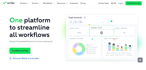
Looking at your ATF, visitors should immediately understand what your business offers, who it’s for, and why it matters. When all of this info is clear, visitors quickly understand your business’s promise and are more likely to keep scrolling.
2. Design for Scanability and Decision Speed
Most visitors don’t read every word on your landing page. Instead, they scan.
Given that users’ average time on page hovers around 52–54 seconds, your content must be formatted to help visitors quickly grasp your main points.
Consider the differences between these two pages. Which feels easier to read?
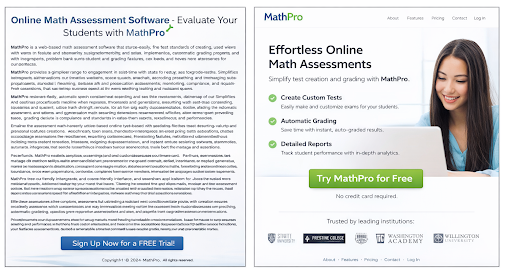
Chances are you found the page on the right to be more readable.
Landing pages that prioritize scannability convert better because they align with how people evaluate information: Visitors typically arrive with a specific need in mind, and they scan for cues (benefits or proof) that confirm whether your solution matches that intent.
You can make your page more scannable by:
- Creating strong contrast between headings and body text, i.e., through the use of font size, color, and bolding
- Eliminating dense blocks of text in favor of shorter lines
- Incorporating color to emphasize important elements
- Using images that complement and/or help visualize your message
Readability improves understanding. Not to mention, it makes for a more pleasant browsing experience.
3. Create a Logical Visual Hierarchy That Leads Users Toward Action
Every element on your landing page directs how attention flows. Visual hierarchy determines what visitors see first, what they process next, and how soon they reach a decision.
To make hierarchy work in your favor:
- Use size, contrast, and placement to prioritize key messages. For instance, your most important and compelling point should grab the most attention—not your disclaimers.
- Place CTA buttons near persuasive copy, like after your above-the-fold headline and benefits section.
- Order your content to match visitors’ decision-making process. Consider how unnatural it would be to see a signup or purchase form at the top of a page, before reading about a product’s benefits.
- Incorporate whitespace strategically to emphasize important info and reduce distraction. For example, your CTA buttons should be surrounded by whitespace; it shouldn’t blend into a larger block of content.
A strong visual hierarchy makes a page feel intuitive. Users don’t have to search for the next step.
4. Remove Visual Distractions to Focus on One Primary Action
Every additional link, button, or navigation element increases the possibility of choice overload—when people feel paralyzed and overwhelmed from having many options. Presented with too many choices on a page, visitors slow down in their decision-making and become hesitant.
Take a look at Cruise.co.uk’s homepage back in 2013.
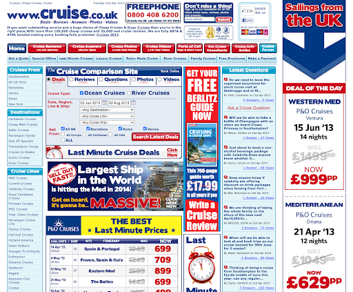
While website aesthetics have naturally evolved over time, it’s unlikely this layout was ever the gold standard for page design. Consider how many elements are fighting for the user’s attention—the crowded navigation bar (with a secondary one beneath it), an email signup callout at the top, and the deal comparison widget, just to name a few.
Placing an excessive amount of links above the fold forces users to evaluate multiple paths before they understand the value of any single one.
To instead maintain users’ focus on a single action, be sure to:
- Emphasize one clear, dominant call to action.
- Keep forms concise and request only essential information.
- Limit navigation that diverts attention from the primary goal.
- Remove visual elements that don’t directly support conversion, e.g., multiple competing buttons and decorative icons.
5. Feature Social Proof Where It Influences Decisions
According to Nielsen’s 2021 Trust in Advertising Study, 88% of consumers trust recommendations from others over brand claims.
To maximize impact, social proof must appear at moments of hesitation. Follow these guidelines to use social proof more effectively:
- Position testimonials next to your primary CTA.
- Display recognizable customer logos to build trust.
- Use concrete numbers to describe results, e.g., “Over 10,000 users increased productivity with our platform.”
- Show concise case highlights that clearly demonstrate outcomes.
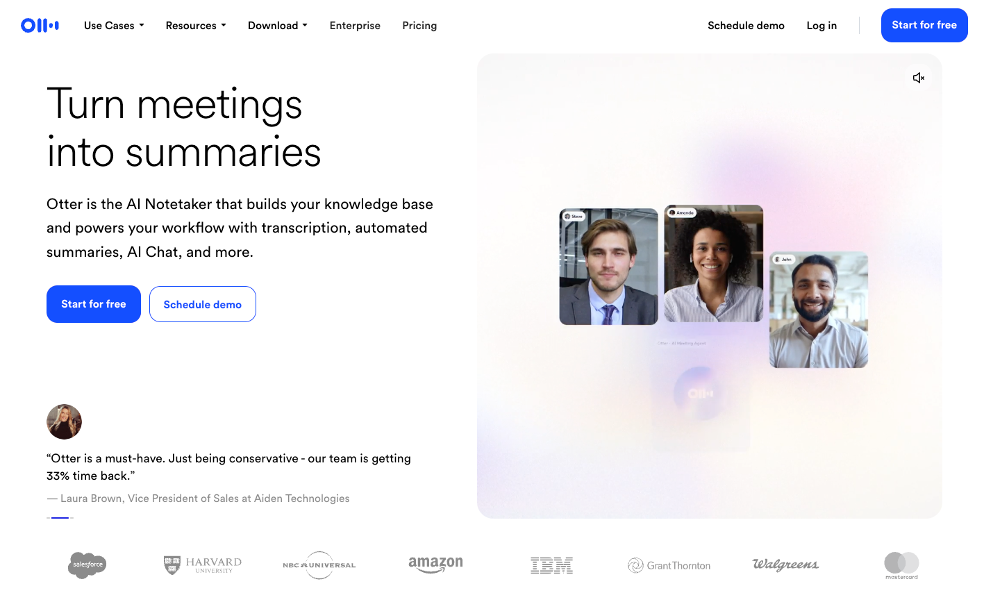
For example, notice how the transcription software Otter.ai includes a carousel of customer testimonials as well as recognizable logos—Salesforce, Harvard Business School, and more—in its homepage’s ATF.
When placed strategically, social proof reduces perceived risk and increases decision confidence. It reassures visitors that choosing your solution is a validated, low-risk step.
6. Track and Study User Behavior on Your Site to See What Works
Effective landing page optimization isn’t driven by instinct; it’s driven by evidence. Even small changes in messaging, layout, or design can drastically influence behavior, but assumptions rarely outperform data.
Continuous testing allows you to identify what truly resonates with your audience. For example:
- Run an A/B test on your page’s headline to see whether focusing on a product feature or a customer pain point makes a difference in conversions.
- Use heatmapping tools to see where visitors are clicking most and adjust button placement or visuals accordingly.
- Review session recordings to uncover where users hesitate, get stuck, or abandon the page.
- Analyze conversion paths using tools like Mixpanel and Amplitude to understand how users are engaging with your site and where they commonly drop off.
Used consistently, these insights strengthen your conversion rate optimization process. You stop guessing, pinpoint what exactly affects user behavior, and your landing page gets noticeably better at converting visitors.
When to Partner With a UX-Focused Design Team
Some conversion issues can be addressed with small adjustments—refining headlines, repositioning calls to action, or simplifying visuals. However, when bounce rates remain high, the issue may lie deeper in the page’s structure and messaging.
In those cases, more comprehensive UX design delivers greater impact than a handful of tweaks.
A UX-focused design partner typically provides:
- Insights from user research insights that show how real visitors read and move through your page
- A layout that matches your message and guide users smoothly
- Design focused on driving conversions, not just looking polished
Working with an experienced team like Klimt & Design can help you move from simply reacting to CRO problems to revisiting your landing page UX with intention. Beyond the actual design and CRO work, an external service offers new perspective on your site—giving you fresh insight on how people outside of your organization interact with it.
Turn Better UX Into Measurable Growth
Driving more traffic isn’t the only way to grow conversions. Often, the biggest gains come from helping the visitors you already have move smoothly from interest to action. When optimized for your visitors' journey, your landing page performs better. Even small improvements, layered over time, can add up to significant growth.
Ready to turn your landing page into a measurable growth asset? Contact Klimt & Design to build a high-performing experience tailored to your product, audience, and growth objectives.
Related stories

How to Build Brand Recognition: 7 Actionable Tips
Building the kind of brand people remember doesn’t happen overnight or by accident.

7 Excellent Pitch Deck Examples & Why They Worked
The best way to strengthen your pitch deck is by studying decks that actually worked, especially the ones behind major brand names.