What Goes Into Building a Brand? All About the Brand Development Process

When founders talk about building a brand, they often mean picking a name, designing a logo, or launching a clean-looking website.
That’s surface work. Real brand development answers harder questions:
- Why should anyone trust your company?
- Why now?
- Why your company instead of the multiple other startups doing something similar?
Think about Apple or Tesla—you probably already have some kind of feeling about them. That reaction wasn’t accidental. It was shaped deliberately through their positioning, messaging, product experience, and years of consistency.
In B2B and venture-backed environments, perception of your brand often forms before a demo is booked, and long before someone speaks to sales. In fact, 81% of consumers say they need to trust a brand before they’ll buy from it, showing how central credibility is to purchase decisions.
Building a memorable brand requires thinking beyond aesthetics and considering how to build user trust. Below, we’ll break down what goes into the brand building process and the key components involved in successful brand development.
What Is Brand Development Strategy?
Brand development is about deciding who you are in the market and making sure that identity holds up as you scale from seed to Series B. A thought-out brand strategy tackles all of this, providing a long-term blueprint for your company’s website design, marketing campaigns, and more.
Some examples of questions your brand development strategy should answer include:
- Who are we for?
- What problem do we solve better than others?
- How do we want to be perceived?
- What makes us different?
- How should that difference show up visually and verbally?
Even well-thought-out products can struggle without clear direction. Communication drifts, and teams end up debating aesthetics instead of focusing on real impact.
Strategic brand identity development removes that ambiguity. It gives your team a shared direction and gives customers something consistent to trust.
Consider how a brand guide like this one from IBM covers everything from typeface to color to photography.
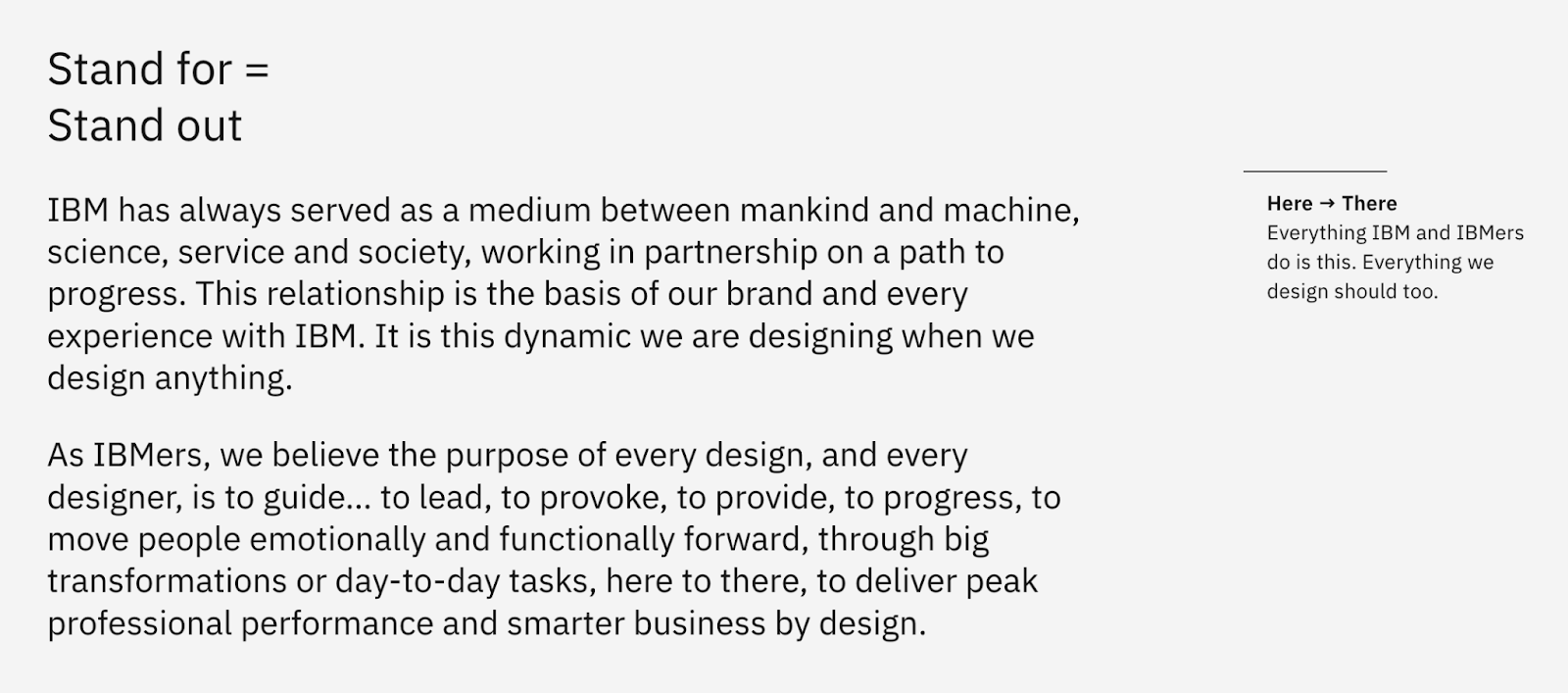
IBM’s meticulously comprehensive brand system acts as a reference guide for decision-making around its design. It explicitly states:
“The care and craft we put into every experience is equal to any confidence or consideration we should expect in return. Every execution of IBM should exude expertise.”
By codifying this as a guiding principle, IBM ensures that every employee—from a software engineer to a social media manager—understands that expertise is their North Star. This removes any debate over aesthetics by providing a clear benchmark: if a design or a piece of copy doesn't exude expertise, it isn't IBM.
Brand Development Starts With Customer Research
Before choosing colors or brainstorming names, you need a clear idea of who you're trying to reach.
This is where many startups rush. They assume they already know their audience. But buyers don’t make decisions the way founders do, especially in B2B.
Customer research should uncover:
- What keeps your target audience up at night?
- How do they describe their problem in their own words?
- What alternatives are they comparing your business to?
- What factors make them trust a company, and what objections slow them down?
Without solid customer research, you might have a brand that looks nice but feels generic. Or, you might create a brand that puts off, even angers, your customers.
Case in point: Frida, a retail brand specializing in pregnancy, postpartum, and baby care products. Its website and LinkedIn proclaim, “We get parents.”
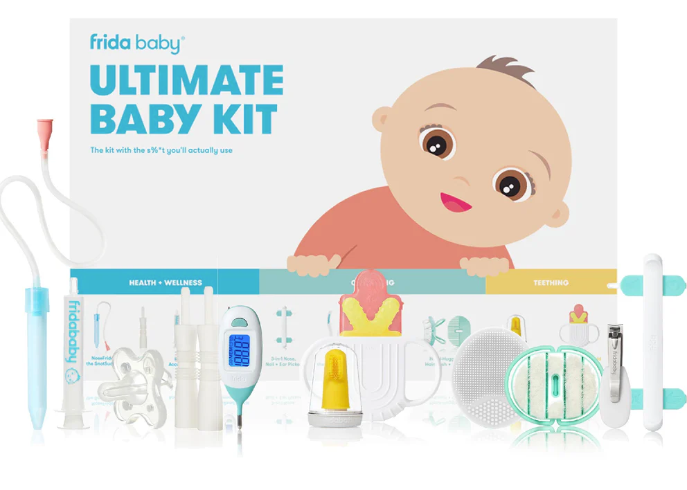
But in early 2026, it came under fire for its older marketing campaigns that used sexual innuendo to market products for infants and new mothers. While the brand likely intended to be provocative or relatable to adults, the execution felt predatory and tone-deaf to many.
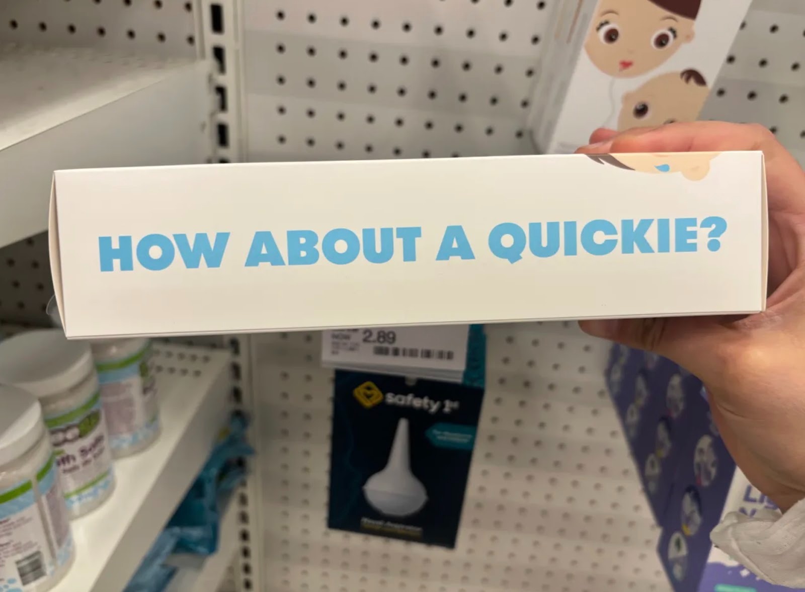
Frida is a cautionary tale of what happens when a brand prioritizes standing out over speaking to its customer. By leaning into shock value, they ignored their audience’s core desires and mindset: parents seeking safety and support for their children.
The controversy over Frida—which ended up posting an apology on Instagram—serves as a good reminder that strong brand development is built on understanding how real customers judge brands.
The 6 Core Components of Brand Development
Once you’ve got a solid foundation of customer research to work off of, the tangible elements of your brand can begin to form. These usually consist of:
- Positioning
- Name
- Logo
- Brand voice and messaging
- Color palette
- Typography
We’ll go through each of these elements and give examples below.
Brand Positioning and Narrative
Your brand’s positioning explains how you’re both better and different from competitors. This difference influences key decisions such as pricing, partnerships, messaging, and even your product roadmap.
When your positioning is clear, design decisions stop being subjective. You don’t debate whether something looks nice. You ask whether it aligns with the role you’ve chosen in the market.
Check out Stripe’s homepage for an example of solid positioning.
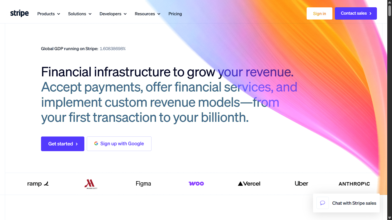
Stripe doesn’t call itself a payment processor. Instead, the homepage describes its service as “financial infrastructure to grow your revenue.”
That wording shapes your perception of the company. By calling its product “infrastructure,” Stripe positions itself as something foundational and essential—like electricity or water. It moves the conversation away from being a widget or tool to being a core part of a company’s architecture. And while most payment processors talk about processing or saving fees, Stripe talks about growth.
It’s also worth noting that Stripe summarizes the value of its complex, technical product in a short punchy snippet. This is the goal of a strong brand positioning: to make your brand’s value easy to understand.
Brand Name
Which brand name is catchier: Blue Ribbon Sports or Nike?
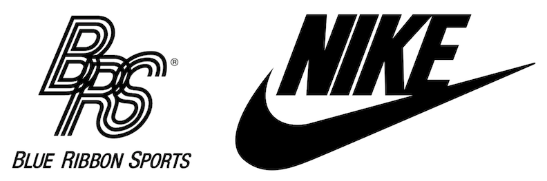
Interestingly, the iconic sportswear giant started out as the former in 1964. It only became “Nike” when it began producing footwear, pivoting to a name suggested by an employee as a tribute to the Greek goddess of victory. Today, it’s hard to imagine Nike’s sleek, bold, and empowering image under the clunkier “Blue Ribbon Sports” title—a mouthful compared to simply Nike.
As the example of Nike shows, brand names shape a business’s first impression and identity. They convey something about a company and also help make a business more memorable.
Consider these other names that reflect the core DNA of their respective brands:
- Google: Originally called BackRub, the name Google is a play on “googol”—the mathematical term for a 1 followed by 100 zeros. It perfectly mirrors the search engine’s mission to organize an infinite amount of information.
- Robinhood: A reference to the heroic outlaw, Robinhood suggests access and the redistribution of power—very fitting as a challenge to traditional finance. That narrative also carries through the brand’s tone and marketing, which feels intentionally disruptive.
- Hulu: Short and sweet, Hulu’s name originates from two Mandarin Chinese phrases and homonyms meaning “gourd” and “interactive recording.” Traditionally used to hold precious items, the name subtly symbolizes the brand’s role as a vessel for premium content.
A strong name defines direction, shaping how a company speaks, who it attracts, and the role it chooses to play in the market. When choosing a name for your business, aim for one that’s:
- Distinct within your category
- Easy to pronounce
- Legally available
- Flexible enough to grow with your product
In venture-backed spaces, being clear usually works better than being clever. If you operate in enterprise AI or fintech, a name that sounds credible and trustworthy will open more doors than one that feels playful but unclear.
Logo
A logo is often the first visual symbol that a person sees from a company. It appears in pitch decks, on product dashboards, and across social channels.
Good logos are:
- Simple enough to be recognizable at small sizes
- Versatile across digital and physical contexts
- Aligned with your positioning
Take Airbnb’s logo as an example.
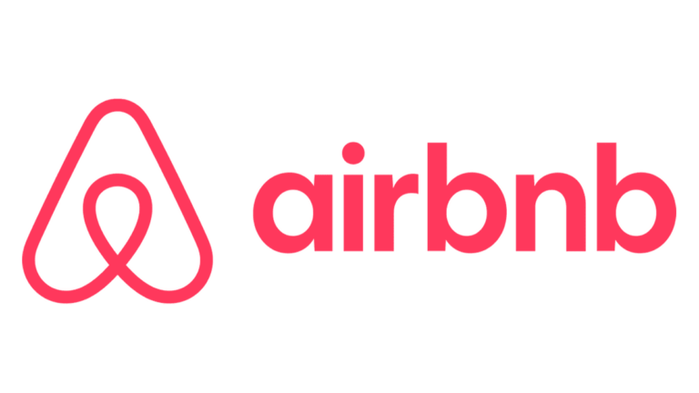
Called the Bélo, the symbol combines four ideas: a person, location pin, heart, and the letter “A” for Airbnb.
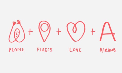
The soft curves and balanced form reflect Airbnb’s focus on belonging and community. Nothing about it feels harsh or corporate—it supports the brand’s mission to “create a world where anyone can belong anywhere.”
Strong logos aren’t complex drawings. They’re a simple, adaptable image that reflects your brand in some way.
Brand Voice and Messaging
While visual identity helps catch consumers’ attention and pique their interest, brand messaging is ultimately what builds trust.
Your brand voice defines how you speak to customers. Is it conversational? Or more authoritative and formal? Language that is too complex can cause friction, while oversimplifying can take away from your business’s expertise.
Take Slack as an example.
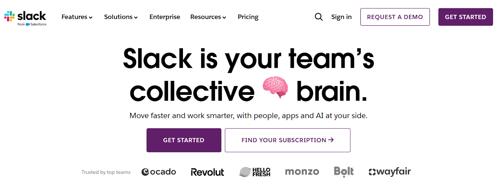
Looking at the homepage, the language feels human and straightforward: “Slack is your team’s collective brain.” The emoji adds a touch of personality, making it professional but not stiff.
The same voice carries throughout the homepage, social media, and even inside Slack’s product. You can see phrases like:
- “One search to rule them all.” (from Slack’s homepage)
- “Let your people connect like people.” (from Slack’s homepage)
- “On a mission to make your working life simpler, more pleasant, and more productive.” (From Slack’s Instagram profile)
- “Keep everyone on the same page with a canvas.” (from Slack’s features page about canvases)
Notice how its messaging focuses on explaining how teams work better together in plain language, not technical jargon. This is consistent across the entire Slack ecosystem, creating one cohesive brand voice.
When your brand voice is consistent across touchpoints, it builds familiarity and predictability—a foundation for building trust with users.
Color Palette
For better or worse, colors convey subtle messages, like a company’s tone and mood. So when it comes to branding, colors are more than an aesthetic choice—they’re strategic, contributing to consumer recognition and emotion.
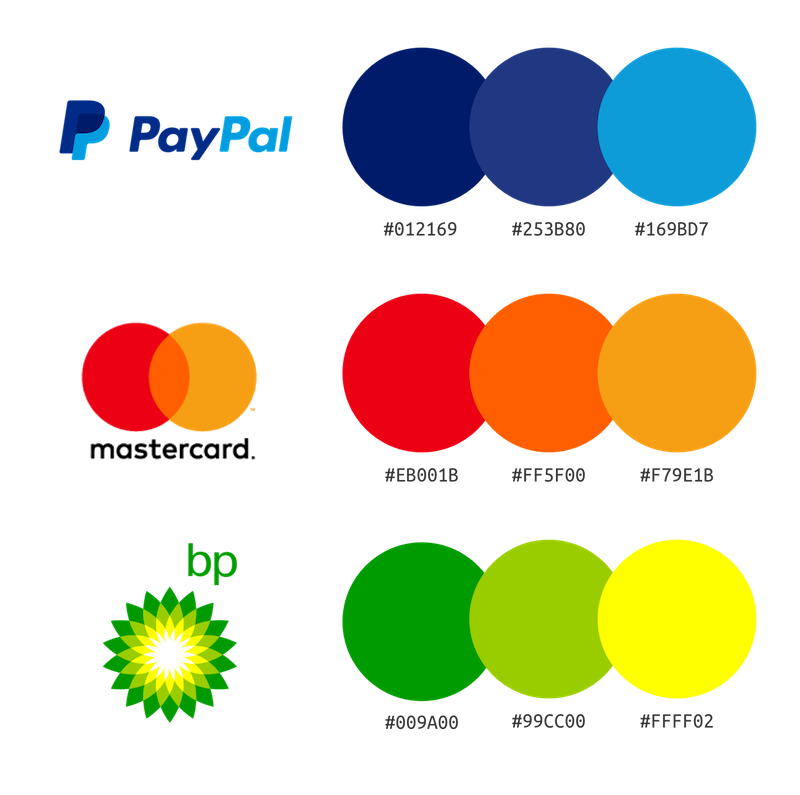
In one study by Paul Bottomley and John Doyle, researchers found that when a brand’s color is congruent with its product's purpose, the brand's message is processed more fluently by the brain. This leads to higher trust and better brand attitudes.
Specifically, their research showed:
- Blue, gray, and black better match functional products like toothpaste and car tires. These colors, particularly blue, seem to communicate competence.
- Red, pink, and orange communicate sensory-social cues, affecting how people feel, e.g., perfume, high-end clothing. These colors are more likely to be associated with excitement and energy.
Bottomley and Doyle’s work suggests that your color palette should match your product. So if your brand is trying to position itself as tough and durable, a rugged color like brown or deep green can do the heavy lifting. Conversely, if you want your brand to come across as fast and innovative, bright, high-energy colors can help create that impression.
Typography
Like color palette, typography—the style and appearance of words, from typeface to size to spacing—can also communicate a brand’s personality. This includes not just the styling of your brand’s name in its logo but also the way language is displayed on your site and other designed materials.
Brands typically use two to three font families, not just one. Many brand systems include:
- a primary font for headlines/logos
- a secondary font for body text
- an optional accent font
Limiting font choices creates a recognizable visual style. For example, a geometric sans-serif font might feel modern and technical, while a serif font may indicate tradition or authority.
Whatever you decide, your typography should complement your story and not compete with it.
Consider Mailchimp. For years, Mailchimp used a clean, recognizable script. But as they expanded from a simple email tool to a full marketing platform, they needed a typeface that reflected their anti-corporate personality.
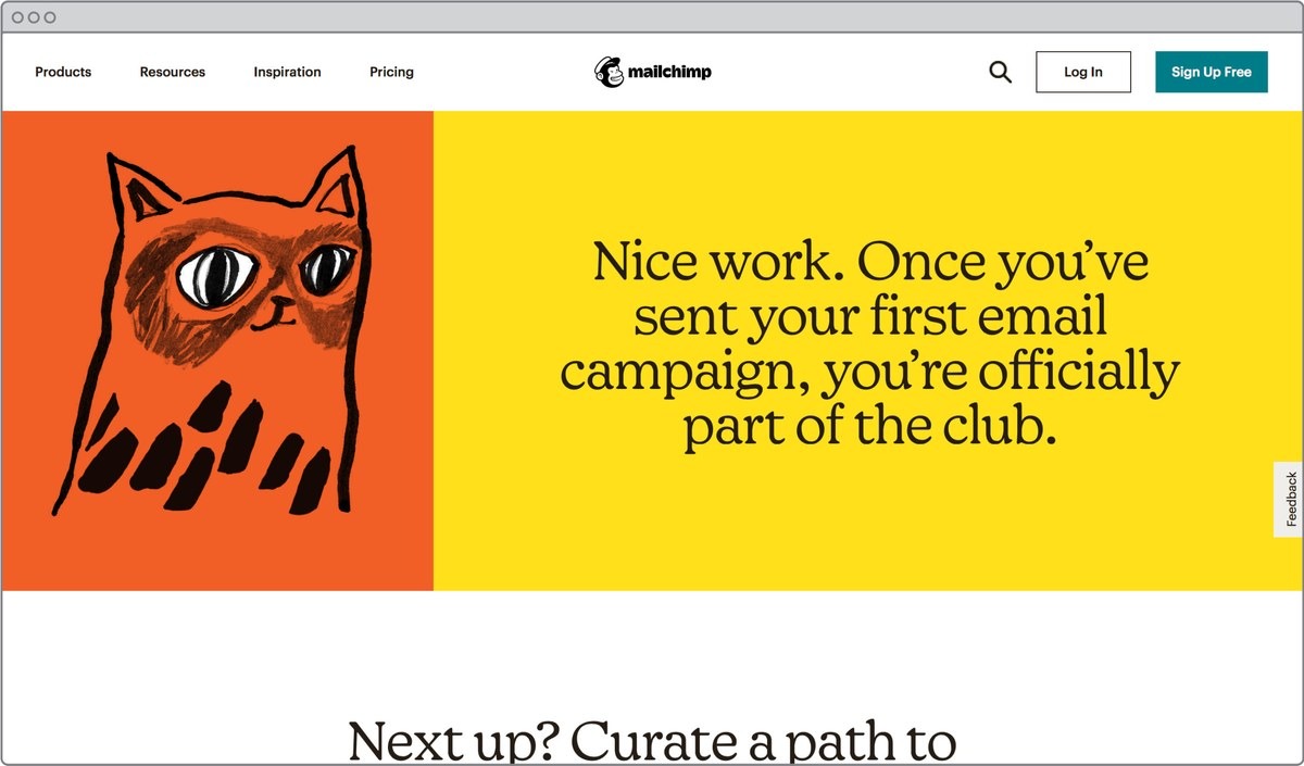
In their 2018 rebrand, Mailchimp introduced Means, a custom serif typeface. While most tech companies were moving toward minimalist, sterile sans-serifs (like Google or Airbnb), Mailchimp went the opposite direction. Though the font feels academic and structured, it has quirky flourishes that give it a hand-drawn, human quality.
Why Work With a Professional Design Partner?
Brand development is the first step before actual implementation—applying your brand identity across your site, product interface, sales and marketing campaigns, and any other asset designed for your company. This requires thoughtful coordination and attention to detail.
In fast-moving startups, internal teams are usually busy with product launches and fundraising. During this time, design tends to become reactive instead of intentional, e.g., some quick images or copy put together for an ad hoc need. This unfortunately opens the door for inconsistencies.
Working with a professional design partner like Klimt & Design can help avoid the disjointed brand identity that often arises as a result. For early-stage companies, an experienced design service brings:
- Faster alignment: Decisions are guided by positioning instead of personal preference. This makes things run smoothly and speeds up rollout.
- Fewer costly revisions: Reworking your brand after Series A is expensive and disruptive. Fixing issues early prevents a costly redesign later.
- Cohesive growth: Your brand should grow with the business. When it’s built on a clear unified strategy, it can expand into new markets and features without losing consistency.
At Klimt & Design, we work closely with venture-backed startups and venture capital funds. We build long-lasting brand systems that hold up no matter if you’re launching a second product or entering a new market. Our goal is defining brands with depth and clarity so you’re not redesigning everything six months down the line.
Ready to Build a Brand That Supports Growth?
For early-stage startups, poor branding can show up quickly when your pitch deck says one thing, your site suggests another, and your product UI feels like a third company entirely. When that happens, buyers and investors hesitate.
Done well, brand development reduces that friction.
At Klimt & Design, we help startups define their positioning and turn brand strategy into real-world assets—from landing pages to investor decks to app UI. If you’d like to explore what that could look like for your company, get in touch.
Sign up for our newsletter
Related stories
Rebrand vs. Brand Refresh: How to Decide What Your Business Needs
A rebrand isn’t the same as a brand refresh. Both can help your business evolve, but they differ in scope.
Two Acquisitions, One Year Later: What We’ve Learned
Acquiring two agencies meant getting a closer look at how different organizations run—and revisiting our own processes.