7 Excellent Pitch Deck Examples & Why They Worked

Raising capital is competitive, and your pitch deck often determines whether investors lean in with curiosity or move on without a second meeting.
In just 10 to 15 minutes, you’re asking an investor to do a lot: understand a real problem, believe your solution is meaningfully better, and trust that your team can scale. Every slide in your deck must earn its place.
The best way to strengthen your pitch? Study decks that actually worked—especially the ones behind major leading companies today.
Below are 7 real pitch deck examples you can use as inspiration, plus what each deck did well. Take a look to find out how strong startups tell their stories and win over investors.
Want a pitch deck that’s credible and investor-ready? Klimt & Design helps founders tell their story so that investors understand and remember your business.
What Makes a Great Pitch Deck?
A great pitch deck tells a focused, persuasive story that builds investor conviction. It connects the dots between problem, solution, and market opportunity in a way that makes the growth path visible.
Below are the five core elements that define exceptional pitch decks:
- A clear problem statement that creates urgency and sets up logic for everything that follows
- An explanation of your solution and how it delivers value
- Info about the market opportunity, i.e., your target segments and their growth potential
- Your business model, including your revenue streams, pricing strategy, and how you acquire customers
- Your competitive positioning, discussing who your competitors are and what differentiates your business
The best pitch decks are easy to follow. Every slide has a purpose, and every claim is supported, helping move investors one step closer to believing “This can win.”
7 Winning Pitch Deck Examples & Why They Worked
Before you start building (or rebuilding) your own pitch deck, it helps to look at successful examples. Below are 7 excellent pitch deck examples and the reasons why they worked.
1. Airbnb
Deck Year: 2008
Stage: Seed
Amount Raised: $600K
Investors: Sequoia Capital, Y Combinator
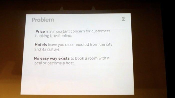
Founded in 2008 by Brian Chesky, Joe Gebbia, and Nathan Blecharczyk, Airbnb (then “AirBed & Breakfast”) focused on a specific travel friction point. Hotels were expensive, rooms were often sold out, and travelers had limited access to the local culture of their destination.
Y Combinator co-founder Paul Graham called the idea “terrible,” but appreciated the founders’ gumption and creativity. His willingness to back the team despite reservations about the concept reflects the conviction that the deck and the founders ultimately built.
Why It Worked
- Compelling, relatable problem: The deck focused on a pain point anyone could understand: high accommodation costs and the inability to connect with local culture.
- Presented multiple perspectives: Airbnb’s founders understood the two-sided nature of their offering and captured it simply in their deck’s solution slide. In it, they described Airbnb as “a web platform where users can rent out their space to host travelers to: save money when traveling; make money when hosting; and share culture.”
- Quantified market opportunity: Rather than relying on imprecise adjectives, Airbnb described its large, scalable market in exact numbers. Its market validation and size slides quantified temporary housing listings and trips booked worldwide, giving investors an idea of Airbnb’s massive growth potential. It’s worth noting that the original market size slide has a typo (“wordlwide” instead of “worldwide”), but was still able to communicate its main point with concrete data.
2. Uber
Deck Year: 2008
Stage: Pre-Seed
Amount Raised: $200K
Investors: First Round Capital
Uber, originally called “UberCab,” was founded in 2009 by Travis Kalanick and Garrett Camp. The idea was born during a snowy night in Paris when the founders struggled to find a taxi. This frustration led to the concept of a ride-hailing app that could connect users with drivers at the tap of a button.
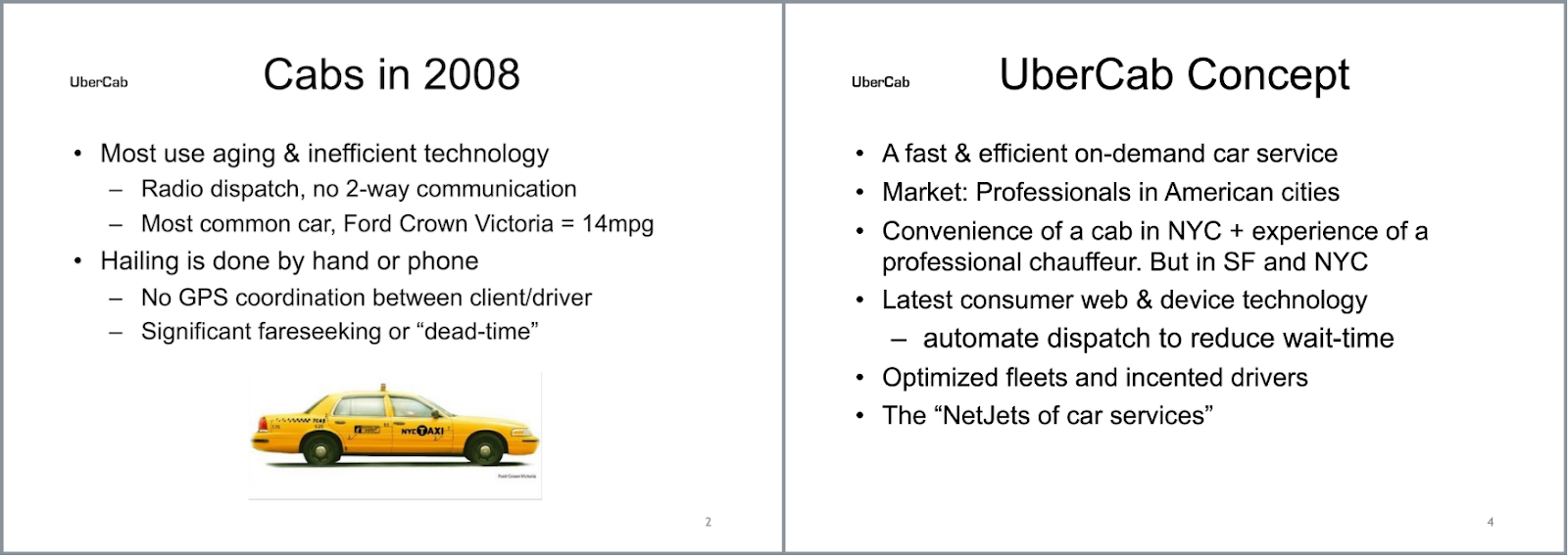
Their pitch deck leans into that pain, highlighting unreliable pickup times and taxi dispatch chaos. Then it reframes the solution in one simple promise: “a fast & efficient on-demand car service” that you can request instantly.
Why It Worked
- A familiar and relatable problem: Highlighting the inefficiency and unreliability of traditional taxi services, the deck emphasized issues like long wait times, lack of GPS coordination, and poor service quality.
- A simple user experience: Uber’s founders positioned the product around ease of use by emphasizing a single action to request a car using mobile or SMS technology. They described it as a “1-Click Car Service,” effectively reducing a complex two-sided marketplace into a single user action.
- Customer-centric storytelling: Rather than overwhelming investors with operational details, the deck focused on the rider experience. For instance, its “Key Differentiators” slide listed features like “Fast Response time” and “Luxury automobiles.”
3. Canva
Deck Year: 2015
Stage: Seed
Amount Raised: $6.6M
Investors: Venture Capital
Canva, an Australian design platform, was founded in 2013 by Melanie Perkins and Cliff Obrecht. The company set out to make graphic design accessible to people without formal training. Within its first year, the platform attracted more than 750,000 users, showing early demand for a simpler design tool. In 2015, Canva’s pitch deck helped secure $6.6M in funding, supporting the company’s rapid growth.
Canva’s deck works because it’s blunt about the gap in the market: design tools were either too hard (pro software) or too limiting (basic templates). The founders position Canva as the middle path—professional output without the professional learning curve.
Early on, the deck puts a number on the opportunity, with one slide stating plainly: “Desktop publishing is a big market. $138.4b big.”
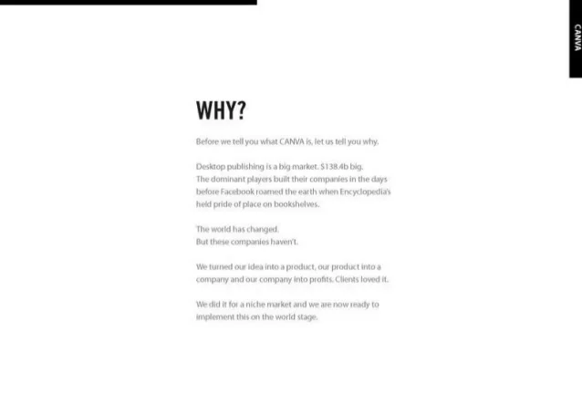
It then argues that traditional tools were built for a different era, describing them as products created “before Facebook roamed the earth.” This contrast positioned Canva as a modern alternative built for non-designers.
Why It Worked
- Focused on accessibility: The deck framed Canva around ease of use rather than professional design. To that end, it centered everyday users, calling out on its solution slide, “ordinary people, extraordinary design.” By emphasizing how quickly non-designers could create visuals, the deck positioned Canva for a much larger audience than traditional design software.
- Strong market logic: The deck supported its vision with concrete numbers (“$138.4b billion market”) and explained how small businesses created marketing materials at the time: outsourcing to designers, using basic tools like Word or Publisher, or learning complex programs like Adobe InDesign. By showing both the size of the market and the friction in existing workflows, the deck made a strong case that a simpler design tool could capture massive demand.
- Explained its viral growth model: Another slide titled “Tentacles, Search Engines & Virality” outlined how Canva could acquire users organically. It explained that Canva’s design templates would become entry points via SEO and that sharing the designs would naturally spread the product.
4. Dropbox
Deck Year: 2007
Stage: Seed
Amount Raised: $1.2M
Investors: Sequoia Capital, Accel Partners
Founder Drew Houston was inspired to create what would eventually become Dropbox after repeatedly forgetting his USB flash drive in his undergrad years at MIT. The product addressed his frustration with keeping files synced across multiple devices.
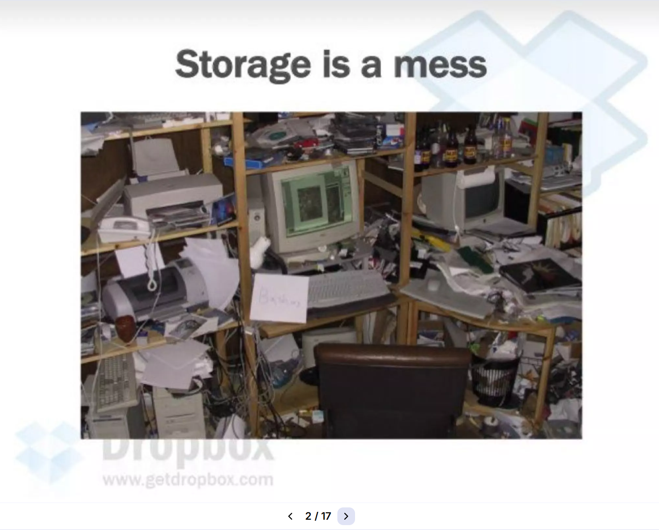
For a relatively complex product, Dropbox’s early pitch deck is a masterclass in explaining something technical without sounding technical. It opens with a simple line: “Storage is a mess.” The visual does the work—a desk covered in devices and cables—before the deck goes on to list the everyday annoyances of keeping files synced.
Investors responded to how clearly the deck explained the problem and solution. Early Y Combinator partner Jessica Livingston reflected on writing the company’s first check in 2007, noting, “Little did I know back then what a momentous cheque this one would be: that 11 years later, Dropbox would be the first Y Combinator company to go public.” Her comment reflects the confidence early investors had in the team and the simplicity of the idea.
Why It Worked
- A relatable problem: Dropbox’s deck doesn’t over-explain. With its blunt “Storage is a mess” headline and image, its opening slide clearly shows the chaos of the problem it addresses. The following slide reinforces the problem by listing everyday challenges: “it’s still a pain to work on multiple computers; share files across a team; put photos, video onto the web; protect files from loss.” By focusing on common user frustrations, the founders made the problem easy for investors to understand.
- A simple, concrete solution: Rather than explain complex infrastructure, the deck described Dropbox in straightforward terms. One slide states that Dropbox “keeps files in sync across computers,” “backed up,” and “accessible from anywhere.” It concludes with the simple line: “It just works.” This framing emphasized ease of use and helped investors immediately grasp the product’s value.
- A memorable product demo: The founders supported the deck with a live demo showing files syncing instantly between devices. Instead of relying on theoretical explanations, the demonstration let investors see the product working in real time. This made the value of seamless file syncing immediately obvious.
5. WeWork
Deck Year: 2014
Stage: Series A
Amount Raised: $17M
Investors: Benchmark, SoftBank
WeWork, a leader in designing and building shared workspaces, was founded in 2010 by Adam Neumann and Miguel McKelvey. The company aimed to revolutionize the way people work by creating flexible, community-driven office spaces. By 2014, WeWork had already expanded to multiple cities and built a growing member base. Its Series D pitch deck helped secure $335M in funding from investors including Benchmark and SoftBank.
Despite WeWork’s later collapse, its 2014 pitch deck is still a useful reference: it shows how a company can package a cultural trend into a compelling investment thesis. Specifically, the deck framed the company as part of a broader shift in how people work. That moved the business from real estate into network effects and member experience, emphasizing that WeWork’s spaces were environments built around collaboration, community, and flexibility.
Why It Worked
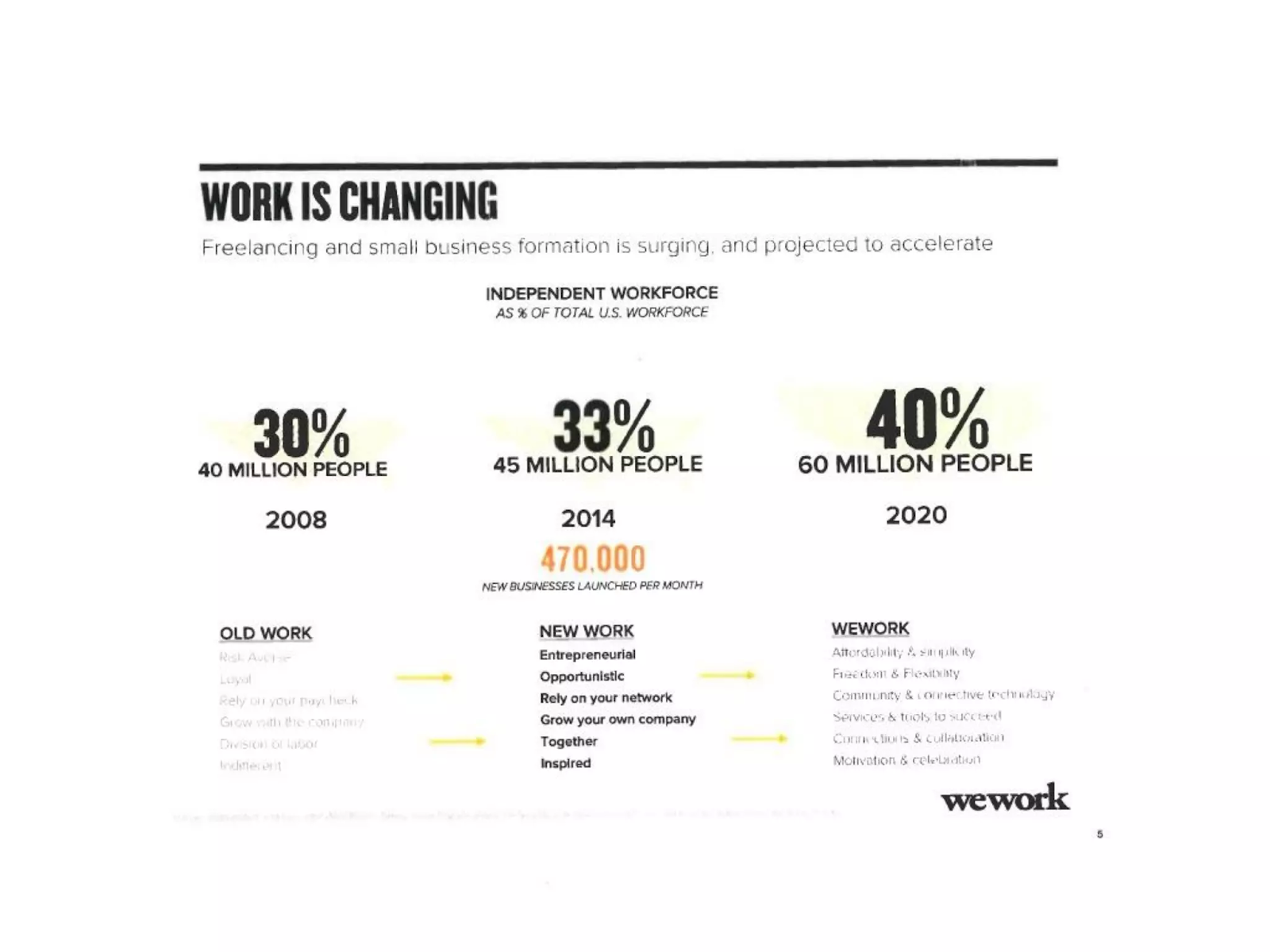
- A clear macro trend: Rather than just stating that work is changing, the deck visualized the shift with data and cultural signals. On one slide titled “Work Is Changing,” WeWork highlighted the rise of independent work in the U.S. with concrete numbers.
- Community as the product: WeWork described its product as more than office space. On its “Creating a New Ecosystem for Work” slide, the company broke its offering into three parts: Space, Community, and Services. This framing shifted the conversation away from real estate and toward network value and member experience—making the business feel more like a platform than a landlord.
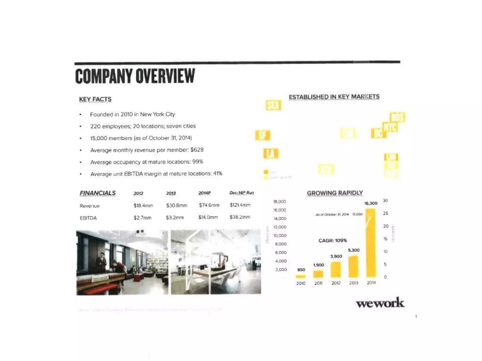
- Evidence of strong traction: The deck backed up its story with concrete operating metrics on its company overview slide, e.g., 20 locations and 15,000 members. These numbers demonstrated that demand already existed, reducing the perceived risk for investors.
6. Peloton
Deck Year: 2018
Stage: Seed
Amount Raised: $3.5M
Investors: True Ventures, Tiger Global
Peloton, a connected fitness company, was founded in 2012 by John Foley. The company aimed to recreate the energy of boutique spin classes at home by combining high-end exercise equipment with live and on-demand workouts streamed through a digital platform. Known for its luxurious indoor bikes, Peloton’s Series F pitch deck in 2018 (below) helped secure $550M in funding, fueling its growth into a global fitness brand.
Though multiple versions exist, the company's early pitch decks all introduced Peloton as a hybrid of fitness hardware, content, and community. It showed how users could join live classes, compete on leaderboards, and interact with instructors from home—bringing the studio experience into the living room. The deck helped investors quickly understand both the product vision and the growing demand for boutique fitness.
Why It Worked
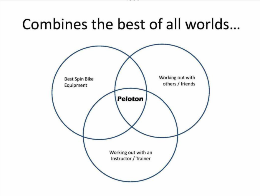
- Clear product positioning: In one of Peloton's earliest decks, a slide titled “Combines the best of all worlds” featured a Venn diagram that placed Peloton at the center. Doing so helped the founders quickly communicate the core idea of bringing the studio spin class experience into the home.
- Supported by cultural momentum: Another slide titled “Spin Studios Exploding” reinforced the timing of the opportunity. It cited a New York Times quote about the growing popularity of boutique cycling classes, alongside images of packed spin studios. This helped investors see that Peloton wasn’t inventing a trend—it was building on one that already had strong demand.
- Concrete product vision: The deck also included interface mockups showing features like live classes, leaderboards, instructor profiles, and a “Join Class” button. These screens made the product feel tangible, demonstrating how users could take classes, compete with others, and interact with instructors from home. Instead of describing the experience abstractly, the deck showed exactly how it would work.
7. Robinhood
Deck Year: 2013
Stage: Seed
Amount Raised: $3M
Investors: Index Ventures, Andreessen Horowitz
Stanford graduates Baiju Bhatt and Vlad Tenev founded Robinhood to challenge traditional brokerage firms by offering commission-free stock trading through a mobile app. At the time, most platforms charged trading fees and required minimum account balances.
The early pitch deck, which secured $3M in seed funding, introduced Robinhood as a simpler, mobile-first brokerage designed for younger investors. One slide described the product as “Buy and Sell Stocks—Zero Cost Trades, No Minimum Balance,” positioning the platform as a clear alternative to traditional brokers.
Why It Worked
- Concise, disruptive value proposition: Early in the deck, Robinhood described its core offering simply: “Zero Cost Trades” and “No Minimum Balance.” At a time when competitors like E-Trade and Fidelity charged transaction fees, this positioning represented a sharp deviation from the traditional brokerage model.
- Early traction signals: Robinhood’s History slide showed strong early interest, noting 10,000 signups in the first 24 hours and 150,000 total users shortly after the company’s announcement. These numbers demonstrated that the idea was already resonating with potential customers.
- Concrete competitive advantage: The Competition slide compared Robinhood directly with brokers like E*Trade, Fidelity, Scottrade, and Schwab, highlighting $0 trading fees and no minimum deposit. By presenting the comparison in a simple table, the deck makes the advantage immediately visible.
Design Your Next Pitch Deck with Confidence
The best pitch decks go beyond explaining a business. Through strategic storytelling and credible proof, they persuade and build conviction.
At Klimt & Design, we help founders translate vision into investor-ready presentations. Whether you’re raising your first seed round or refining a deck for a major Series B/C process, we’ll help you align story, strategy, and visual impact.
Ready to elevate your pitch? Reach out to Klimt & Design to build a deck that commands attention and drives results.
Sign up for our newsletter
Related stories

How to Build Brand Recognition: 7 Actionable Tips
Building the kind of brand people remember doesn’t happen overnight or by accident.

What Goes Into Building a Brand? All About the Brand Development Process
Brand development is about more than picking a business name and designing a logo. We explain its key components.