8 Common Web Design Mistakes (And How to Fix Them)

You have about 50 milliseconds to make a first impression on a website visitor. That’s 0.05 seconds before they’ve already formed an opinion about your brand and decided whether to stay or bounce. For B2B startups competing in crowded categories, that fraction of a second matters more than you might think.
In this post, we’re breaking down why website design is a make-or-break factor for B2B startups, the eight most common design mistakes we see, and exactly what to do about each one.
Is poor web design making your business look unprofessional? Klimt & Design helps startups earn trust and build credibility through clean and polished website design. Reach out to learn more.
Why B2B Website Design Matters For Startups
Website design matters for all B2B businesses, but it’s especially important for software companies.
According to Foundry’s 2025 Customer Engagement Report, 46% of IT decision-makers visit a vendor’s website after encountering valuable content. That means if you’re already creating and distributing content for your ICP, whether on LinkedIn or search engines, there’s a nearly 50% chance that they’re already checking out your website to learn more.
Once there, potential customers will expect a smooth user experience. They want to quickly understand:
- what you do,
- why it matters to them,
- and what they should do next.
If your website fails to deliver on any of those three things, you’ve likely lost them.
Website UX is directly tied to business outcomes. A well-designed site builds trust, reduces friction, and moves prospects through your funnel faster. A poorly designed one does the opposite, undermining even your best marketing efforts before a conversation ever starts.
The 8 Most Common Website Design Mistakes
Here are the eight most common website design mistakes we see B2B startups make, and how to address each one.
1. Your Site Isn’t Mobile-Friendly
According to Statista, more than 62% of global web traffic now comes from mobile devices. So if your website isn’t optimized for mobile, you’re automatically limiting who can have a smooth experience on it. What’s worse, you may even be handing leads to competitors whose sites are mobile-friendly.
If you’re unsure whether or not your website is mobile-friendly, try viewing it on multiple devices, not just desktop. Pay close attention to font sizes, button tap targets, and load speed on mobile networks. This can be fixed by using a responsive or dynamic design framework that automatically adapts your layout to different screen sizes.
2. The Navigation is Confusing
If visitors can’t find what they’re looking for within a few clicks, they leave. A missing footer menu, vague page labels like “Solutions” with no context, or a navigation bar that disappears when you scroll are all friction points that hurt website engagement.
To improve your site’s navigability, try applying these best practices:
- Use clear, descriptive labels in your main navigation.
- Add a footer menu with links to your key pages such as About, Pricing, Contact, or Services.
- Consider a sticky header so navigation is always accessible.
- If your site has a lot of content, add breadcrumbs so visitors always know where they are.
The goal is to make it easy for visitors to navigate between pages because the longer they explore, the more information they’ll consume about your business. And with a better understanding of what you do and who you help, they’ll be more likely to convert.
3. Your Site’s Content Hierarchy is Disorganized and Unclear
Your website should guide visitors from problem to solution to proof to action. When headings, body copy, and visuals all compete for equal attention, that story falls apart and visitors don’t know where to look or what to do next.
To address this, put yourself in the shoes of someone visiting your website for the first time. What do you want them to know right away? That should be your main header. Where do you want them to go next? Use visuals that lead them down the page.
Here are a few other ways to create a clear content hierarchy:
- Use a clear heading structure to organize your content.
- Place your most important value propositions above the fold.
- Use visual weight, like size, color, and contrast, to direct the eye toward key messages and CTAs.
With website design support from Klimt & Design, the software company HumanFirst is a great example of a well-structured homepage that’s easy to follow.
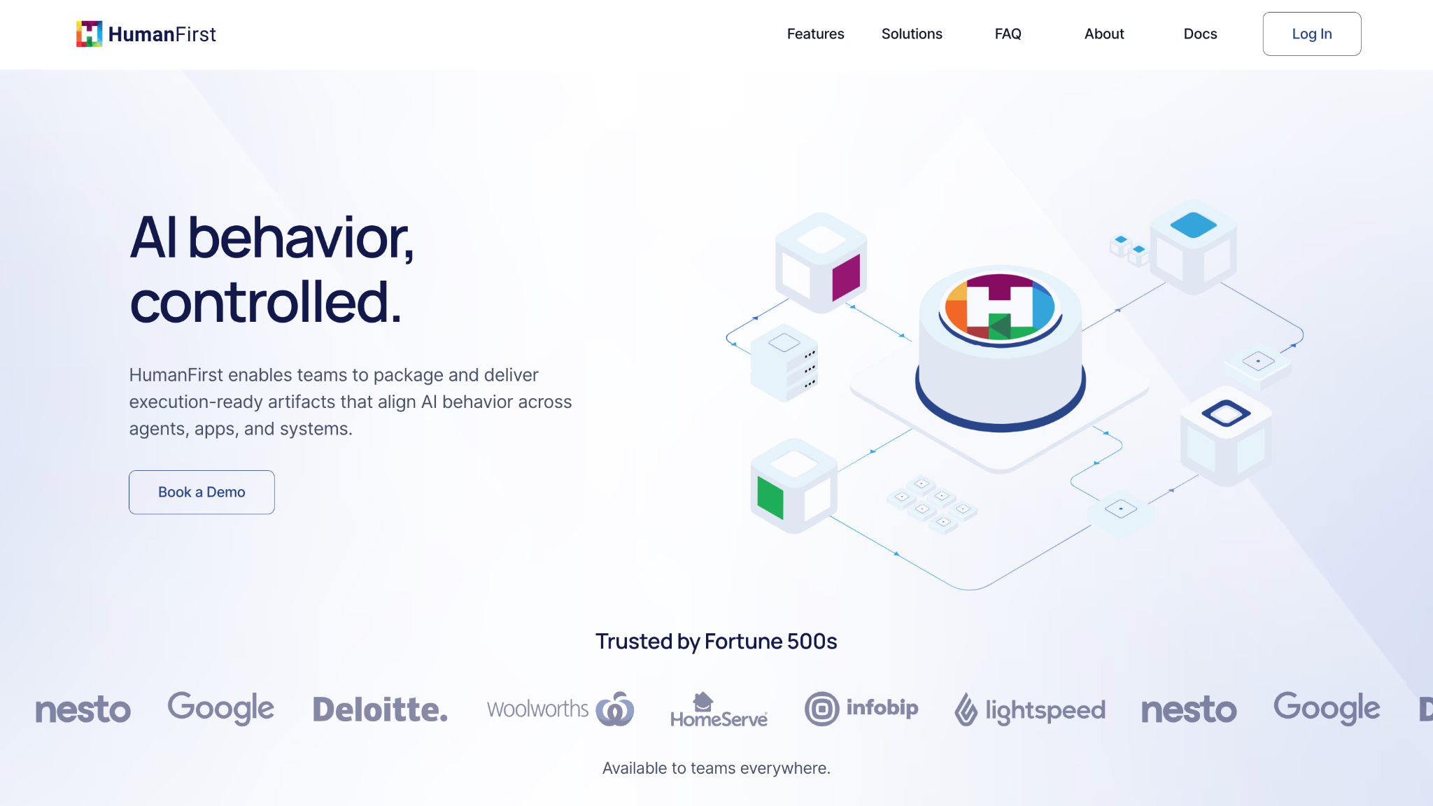
Consider its content hierarchy:
- HumanFirst presents a clear value proposition through its above-the-fold heading and descriptive subtitle.
- An inviting CTA (Book a Demo) follows as a logical next step for interested visitors.
- Social proof, represented as a logo reel and the “Trusted by Fortune 500s” subheading, offer reassurance that HumanFirst has a trusted solution.
- Scroll further, and HumanFirst gives additional detail through text and imagery about how it works. This includes a product use case section about different users (teams and developers).
- Following the features breakdown, another Book a Demo CTA appears—perfect for converting once-skeptical users who now have more understanding of HumanFirst.
- An FAQ section at the bottom of the homepage offers more explanatory information for users needing further clarity.
Instead of overwhelming visitors with a lot of info from the get-go, this content hierarchy educates visitors in a logical sequence.
4. Your Branding is Inconsistent
If a prospect discovered your company on LinkedIn and then landed on your website, they should immediately recognize your brand from earlier. Inconsistent fonts, colors, imagery, or tone of voice create a disjointed experience that feels unprofessional—and unprofessional quickly erodes trust in B2B settings.
To avoid this, develop a simple brand style guide that defines your core colors, typography, logo usage, and tone. Apply it consistently across every page of your site, and make sure it aligns with how you show up on social media, in email, and in your sales materials.
5. You’re Missing Social Proof
The B2B buyer journey is longer than in most industries. In 2025, the average buying cycle was 10.1 months. Before a prospect talks to your sales team, they want to know that other people have already worked with you and come out ahead as a result.
To address this, your website should include trust signals that demonstrate your brand’s credibility. A few tactics to consider:
- Add customer testimonials and recognizable brand logos throughout your site.
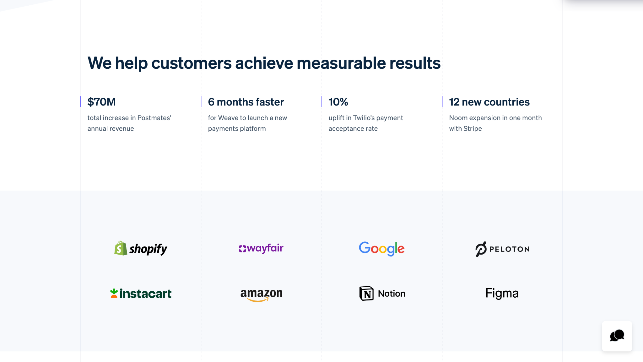
- Create a dedicated Customers page to share high-level information about your customers. Take Stripe’s Customers page as an example. It lists clear, measurable results that its customers have achieved by using the platform, along with company logos for added social proof.
- Publish case studies that highlight individual customer successes and detail how your product or solution positively impacted them. Unlike the aforementioned Customers page, these case studies should show a specific customer’s experience before and after using your product or solution. Make sure they explain precise outcomes. For example, “We increased pipeline by 40% over six months” is stronger than “We improved pipeline leads.”
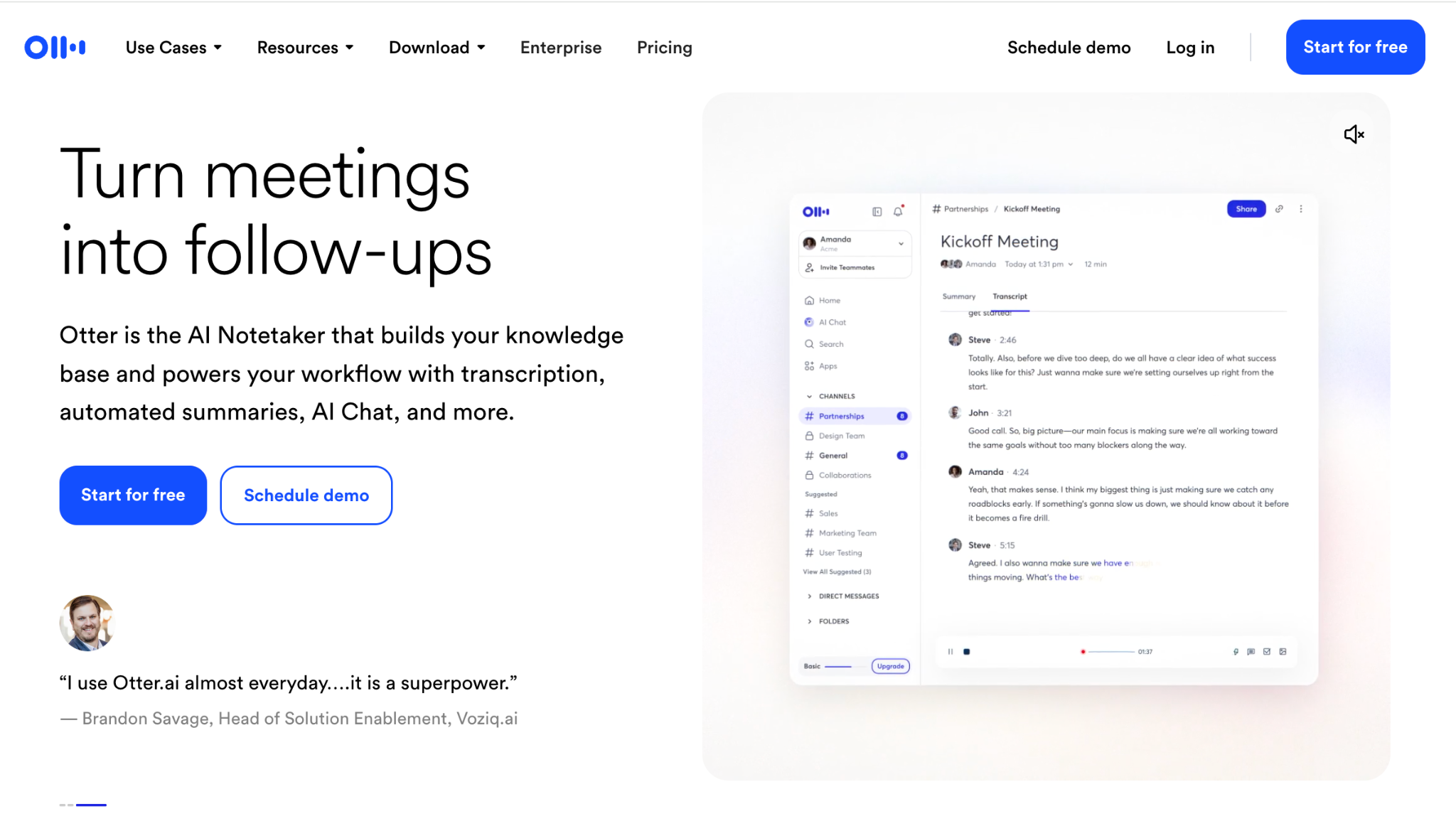
- Put a strong testimonial near your primary CTA. Consider how Otter.ai places a carousel of customer quotes directly below its homepage’s CTA.
6. The Site Pages Are Loading Slowly
According to research from Google, 53% of mobile users abandon a site that takes longer than three seconds to load. Slow load times are not only a frustrating experience for users, but they also eliminate your opportunity to make any impression at all.
If you’re not sure what your site’s load time is, run it through Google PageSpeed Insights regularly to catch issues early. There are a few ways to improve load times:
- Compress your images before uploading them using tools like TinyPNG.
- Minimize the use of “bloated” code and third-party plugins.
- Use a content delivery network (CDN) if you’re targeting a global audience.
7. There’s Too Much Visual Clutter
Less is indeed more when it comes to web design. Using five different fonts, a rainbow of brand colors, auto-playing videos, and dense blocks of text doesn’t make your site feel expansive or interactive. Instead, visual clutter pulls attention away from your message and makes it harder for visitors to focus on what matters.
Avoid this by following these design best practices:
- Stick to two fonts, one for headings and one for body copy, and about two to three brand colors.
- Use white space intentionally. Rather than view it as empty space, consider white space breathing room that makes your content easier to digest.
- When in doubt about a color, font, or visual, cut it. If a design element isn’t reinforcing your message, it’s probably working against it.
8. You’re Missing CTAs
Getting someone to your website is only half the battle. If they’re interested in your business, your website should encourage them to continue engaging further. Buried contact info, generic “Contact Us” buttons, or pages with no CTA at all leave motivated prospects with nowhere to go.
With that in mind, remember to:
- Add a clear, specific CTA to every page on your site. The exact CTA should logically reflect the best next step the user should take based on the content nearby, whether that’s to book a demo, start a free trial, view case studies, or something else.
- Place at least one CTA above the fold, where it’ll be highly visible. Repeat the CTA again at the bottom of the page for users who have scrolled down.
- Include a contact form that’s intuitively easy to find, like in a modal overlay when a Contact button is clicked.
For some inspiration, consider the SaaS platform Orbit, which Klimt and Design supported with brand identity and website design.
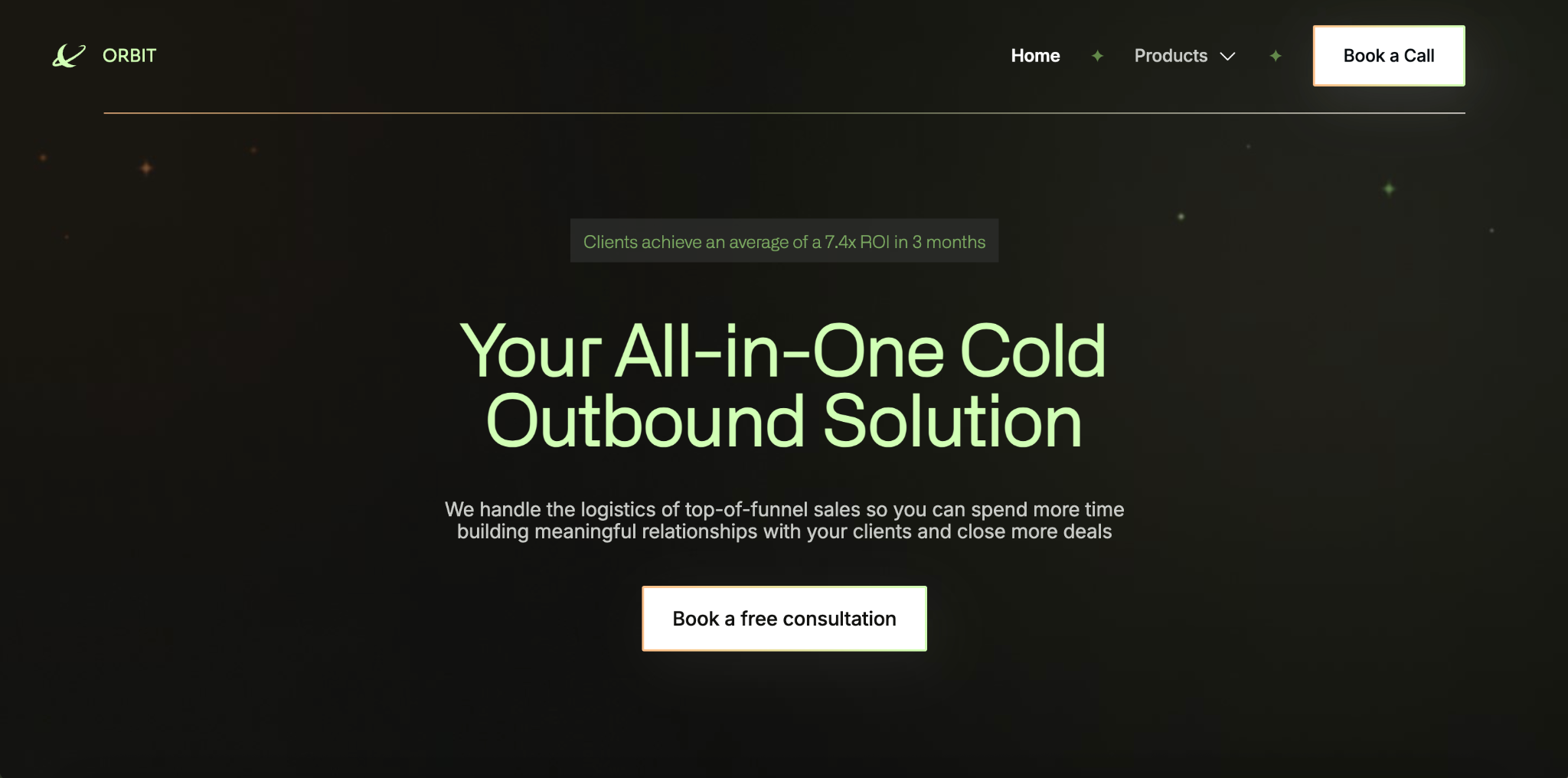
When designing its site, we included relevant CTAs that corresponded to the surrounding content:
- “Book a Call” in the sticky top navigation menu
- “Book a free consultation” above the fold, following Orbit’s descriptive header and subtitle
- “Learn more” beneath each of Orbit’s product offerings (Self-Serve Tools and Managed Service)
- “Book a consultation” and “Get started” toward the end of the page, under “Get into Orbit”
Getting Website Design Right
Your website is often the first real handshake between your brand and a potential customer. If you’ve spotted a few of these mistakes on your own site, the good news is that all of them are fixable.
But getting the design right is an ongoing effort that requires time, intention, and a clear eye for what’s working and what isn’t. Between running your business and marketing your product, finding the time to audit, redesign, and continuously improve your website is a tall order for most small teams.
That’s where working with a design agency can make a big difference. Rather than patching problems one by one, a good agency brings a holistic perspective by aligning your visual identity, UX, messaging, and conversion strategy into a site that converts. If you’re ready to capture impressions and convert leads into customers, learn how Klimt & Design can help.
Sign up for our newsletter
Related stories
Two Acquisitions, One Year Later: What We’ve Learned
Acquiring two agencies meant getting a closer look at how different organizations run—and revisiting our own processes.

How to Choose a Web Design Agency (and Spot Red Flags)
Many agencies look similar on the surface. We explain what to look out for to find the right fit for your business.