Landing Page UX: How Page Design Guides Users Along The Customer Journey

You’re getting clicks, but conversions aren’t following. Before you adjust your traffic strategy, take a closer look at your landing page user experience (UX). Landing pages rarely fail because of traffic alone—they fail because the page doesn’t adequately guide visitors toward a decision.
Landing page UX determines how visitors move from first impression to confident action. In seconds, users decide whether your page feels relevant, trustworthy, and easy to navigate. The order of your content and the placement of calls to action shape that decision long before anyone fills out a form.
A well-designed landing page can build momentum toward conversion, while a poorly structured one impedes it. Improving your landing page’s UX can help you reach—or even exceed—the average 6.6% conversion rate.
What Is Landing Page UX?
Landing page UX refers to how your page is structured to guide a visitor toward a specific action. It determines what users see first, how information unfolds as they scroll, and how easily they can move from curiosity to commitment.
When your landing page UX is thoughtful, visitors immediately understand what your business is offering, who it’s for, and what to do next. In practice, UX is the logic of your page: the order in which visitors learn key information and the ease with which they can act on it.
UX vs. UI vs. Copy: Why the Distinction Matters
These terms are often thrown around in the context of designing and optimizing a site, but they play different roles on a landing page.
- UX (user experience) defines a page’s structure and flow. It’s how information is organized, how the page supports user intent, and whether the path to conversion feels straightforward. UX answers: Does this page help the user make a decision?
- UI (user interface) focuses on visual styling. This includes typography, spacing, color, imagery, and brand expression. It’s more about creating aesthetic appeal while UX focuses on creating a smooth user journey. UI answers: Does this page feel polished and readable?
- Copy is the text on a page that communicates your business’s message. It explains your business’s main value proposition, clarifies benefits, and reduces uncertainty. Copy answers: Do users understand what they’re getting—and why it matters?
A site could have a stellar UI—that is, a sleek and attractive appearance—and yet fail to convert visitors because its UX is poor, with terribly long and rambling copy. And a page can have strong copy but underperform if the UI and UX create friction. In any case, UX, UI, and copy work together to create high-converting landing pages.
The Role of UX in the Customer Journey
A high-performing landing page is a guided experience. Each part of the page should support a specific decision the visitor is making, from first impression to final action. When UX aligns with how buyers actually evaluate their options and make purchase decisions, users reach the CTA already convinced—not still searching for missing information.
Let’s look at how landing page user experience supports each stage of the typical customer journey.
Awareness Stage
Studies have shown that users form first impressions about a website in as little as 50 milliseconds. That means your headline, layout, and visual hierarchy need to convey a clear message immediately. If users hesitate in those first moments, the rest of the page may never be seen.
Consideration Stage
Once users understand what you offer, they begin evaluating whether they can trust you. In fact, 90% of software buyers are influenced by some type of social proof during this phase. Testimonials, recognizable client logos, case studies, certifications, and performance metrics all reduce perceived risk.
Where you place social proof matters as much as the proof itself. It should appear at logical moments in the page flow—often right after you introduce a claim or benefit—so it feels like support, not decoration.
Conversion Stage
By the time a user reaches the conversion stage, your job is to make action effortless. Strategic CTA placement removes hesitation at key decision points. For example, after reading a product description, users may decide whether to add an item to their cart. Each repetition of the CTA should feel contextual, appearing after a benefit section or proof point that strengthens intent.
The design of the CTA also matters. Clear, action-oriented language performs better than generic labels. Instead of “Submit,” use language that reflects the user’s goal, such as “Book a Demo” or “Start My Free Trial.”
How to Identify Poor Landing Page UX
A landing page can look polished, match your brand, and still fail to convert. Before you rewrite your offer or spend more ads, find out how exactly users are moving through the page.
Landing page UX shows up in your data—but only if you know what to look for. The goal is to spot where users bail early, hesitate, or reach a decision point without enough clarity.
Here are three metrics to watch out for and what they usually mean for your page’s UX.
High Bounce Rates
A high bounce rate means visitors land on your page and leave without interacting further. This typically signals a breakdown at the very first point of contact, where your headline and initial value proposition appear in your page’s above-the-fold layout.
A high bounce rate can indicate one or a few issues:
- Your message may be too vague.
- The above-the-fold design doesn’t make the next step obvious.
- The page may not match the intent that brought users there in the first place.
What to check: Compare bounce rate by traffic source, e.g., paid vs. organic, campaign A vs. campaign B. If one source spikes, it may be indicative of a message match problem—like a misleading ad campaign. However, if all sources spike, it’s often an above-the-fold clarity problem.
Low Conversion Rates
If visitors scroll, read, and spend time on the page but still don’t convert, the issue could be mid-page or at the conversion moment.
Common causes include:
- Claims appear before proof, making your benefits feel unsupported.
- The form appears before your business’s main value prop is established.
- The CTA feels risky (e.g., “Talk to Sales”) relative to the visitor’s stage.
- The page asks for too much too soon, like presenting an excessively long form before users are actually won over.
What to check: Look at drop-off around key sections like pricing, FAQs, and form interaction. If users reach your form but aren’t submitting, that’s a sign of lingering skepticism.
Short Time on Page
When visitors spend only a few seconds total on your page, it’s a red flag that your content isn’t resonating. That could be because:
- Your page doesn’t spell out clearly why users should care.
- Critical information, like what your solution is and why it’s important, is hidden or nonexistent.
- The layout is visually dense or hard to scan.
What to check: Analyze this metric alongside scroll depth. If time is short and scroll depth is low, the problem is typically related to your page’s above-the-fold section.
Useful Tools for Diagnosing UX Issues
If you’re seeing chronically underperforming conversions on your page, the first step is figuring out why it’s happening. Try one or a few of the tools below to get more insight on where users hesitate and the potential obstacles preventing them from moving further along the buyer journey.
Heatmaps and Session Recordings
- Hotjar: Offers heatmaps, session recordings, and surveys to understand user behavior
- Crazy Egg: Provides click tracking, scroll maps, and session recordings
A/B Testing
- Optimizely: A leading platform for A/B and multivariate testing.
- VWO (Visual Website Optimizer): Allows A/B testing, heatmaps, and user surveys
Behavioral Analytics
- FullStory: Combines session recordings with detailed behavioral insights
- Mouseflow: Tracks clicks, scrolls, and form interactions with session replays
Surveys and Feedback
- Qualtrics: Gathers user feedback through surveys and forms
- Usabilla: Collects in-the-moment feedback directly from users
3 Real-Life Examples of Effective Landing Pages
Strong landing page UX becomes clearer when you examine how high-performing companies set up their pages. Across industries, the most effective landing pages generally prioritize messaging clarity and a single focused call to action.
1. Stripe - Billing Page
Stripe’s billing page is an excellent B2B example of landing page UX because it reads like a guided argument, beginning with a promise and building credibility to get users to take action.
Right away, Stripe makes the value proposition unmistakable with a benefit-led headline: “Accelerate growth with Stripe Billing.”
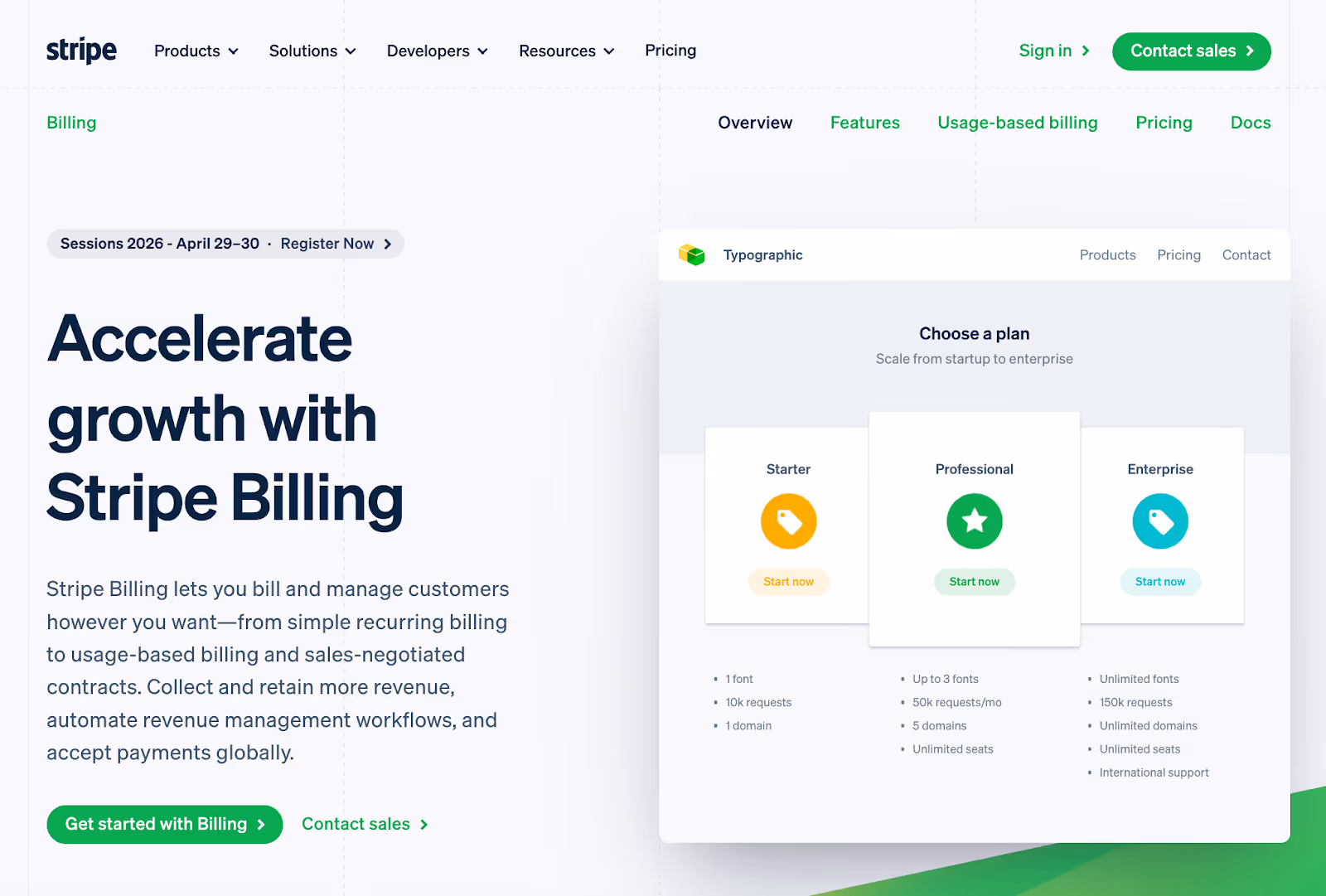
This is then followed by a plain-language explanation of what the product enables: billing and managing customers “however you want.”
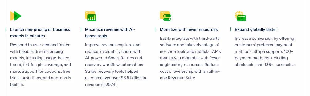
As users scroll, Stripe reinforces the promise with specific outcomes rather than generic claims: faster launches for new pricing models, tools to reduce churn and increase revenue capture, and global expansion support. Each section gives users an idea of what they can achieve with Stripe.
Then the page builds trust with recognizable customer logos like Nasdaq and Instacart before diving deeper into info for specific audience segments (developers and business teams).
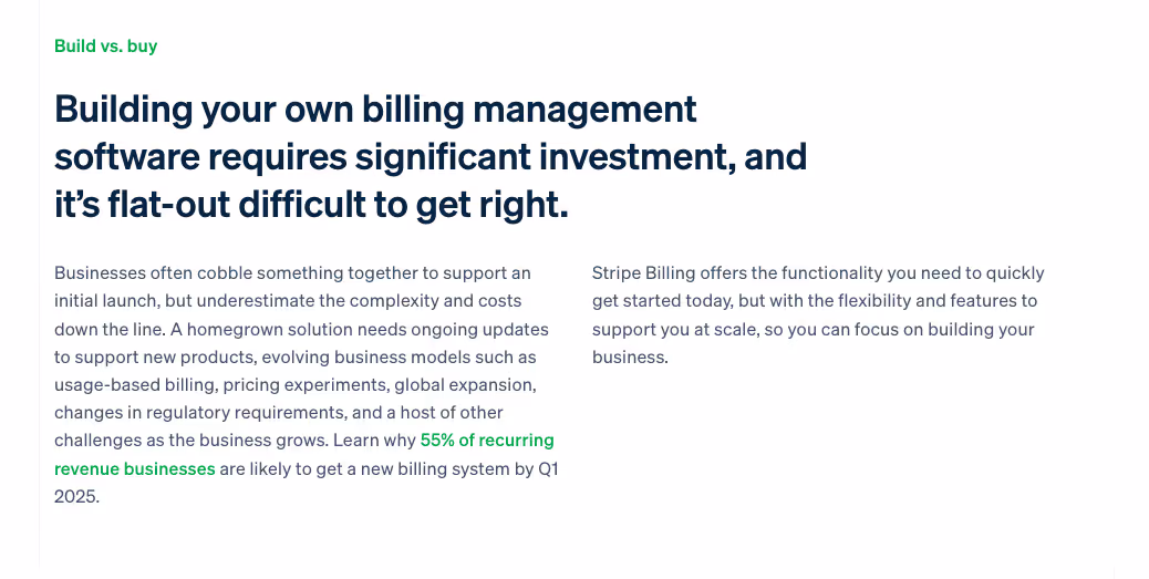
At the end of the page, Stripe presents a “Build vs. buy” section, where it digs into a major pain point: the challenge of creating your own billing software. Here, it reminds readers of how time-consuming the alternative of a DIY software is—and how you can avoid that by getting started with Stripe Billing immediately.
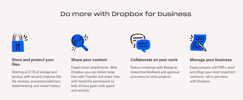
2. Dropbox - Business Page
Dropbox’s landing page for business solutions is a masterclass in simplicity and persuasion. Consider its above-the-fold section.
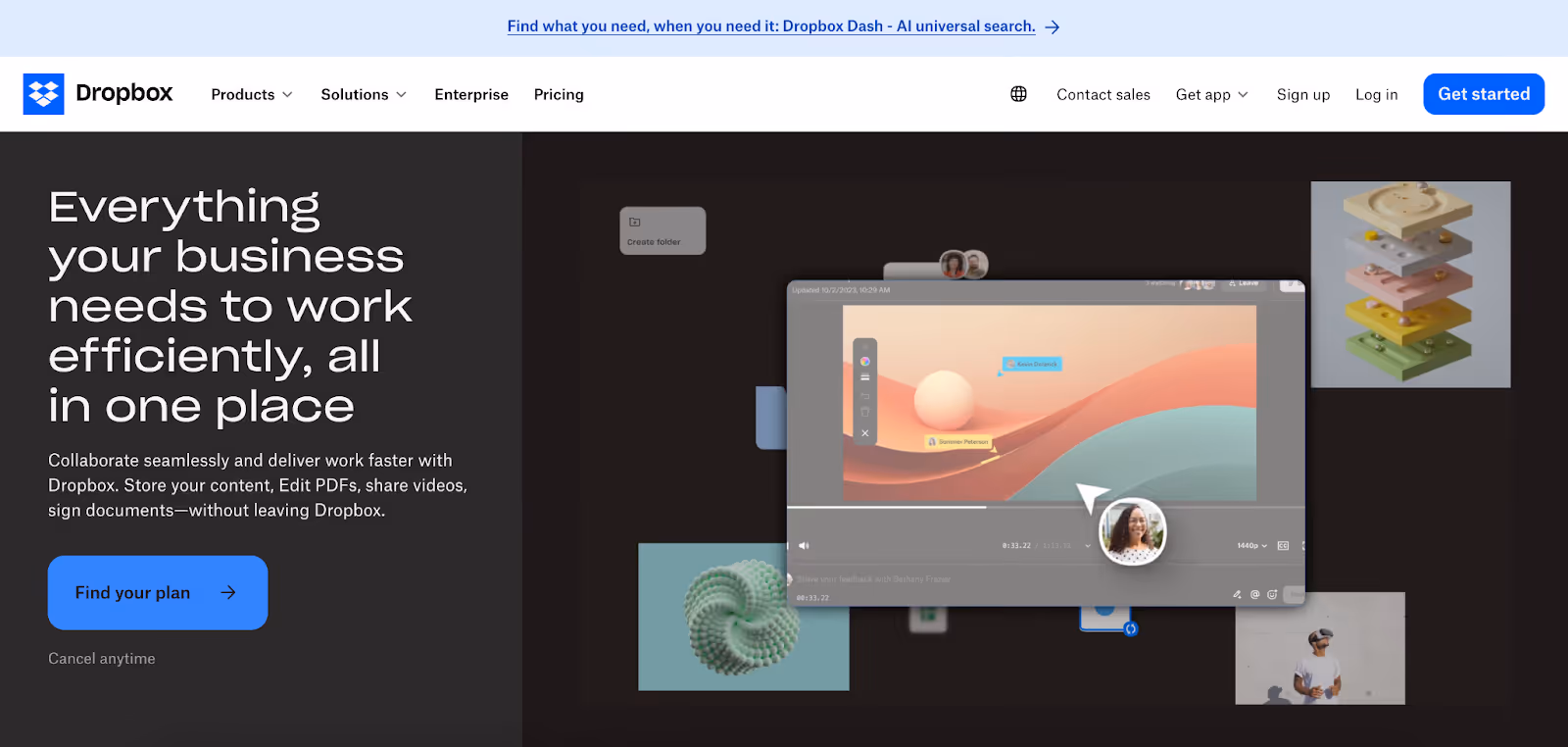
Set alongside an animation showcasing various Dropbox features, the page headline clearly communicates the product’s core benefit: "Everything your business needs to work efficiently, all in one place.”
Below the headline, the page’s subhead explains the product’s value in more detail, using plain language rather than technical jargon. Then there’s the straightforward CTA button (“Find Your Plan”), which is followed by additional reassurance with the simple line, “Cancel anytime.”
Further down the page, Dropbox reinforces the product’s main features and their benefits to users. This functions like an expansion of the page’s earlier above-the-fold subhead, offering more detail on what exactly users can get out of Dropbox.
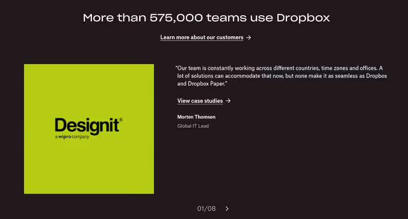
Finally, Dropbox provides social proof that quantifies the number of teams using its product. Beyond simply giving this figure, though, Dropbox also shows off case studies, with a link to view even more.
3. Netflix - Subscription Landing Page
Netflix’s homepage is a solid example of using simplicity to convert visitors into subscribers. It doesn’t have much text, but the little it does have is strategically used to spell out its top selling points. Consider all of its above-the-fold text:

- Headline: Unlimited movies, TV shows, and more
- Subhead: Starts at $7.99. Cancel anytime.
- CTA: Ready to watch? Enter your email to create or restart your membership.
The messaging is clear and benefit-driven, addressing common objections around commitment and flexibility (“Cancel anytime”). And regardless of whether they’re a brand new or returning member, the next step for visitors is easy; they need only enter their email address to move forward.
Meanwhile, images of popular shows and movies are visible in the background. It’s an effective way to visualize the product and even entice users.
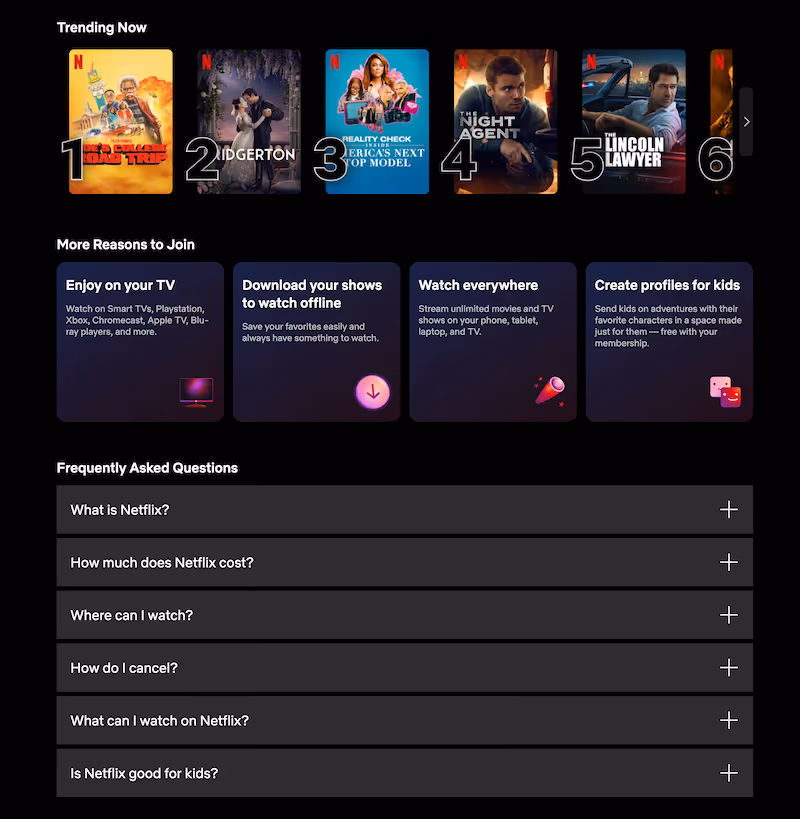
Scroll further down, and Netflix gives more reason for visitors to convert. First, it calls out its most budget-friendly plan: “The Netflix you love for just $7.99. Get our most affordable, ad-supported plan.”

Then, after displaying currently trending shows and movies, it offers a “More Reasons to Join” section, followed by an FAQ. The content flow helps Netflix reduce perceived risk in a logical manner, matching how a visitor might process and decide whether or not to subscribe.
Turn Your Landing Page Into a Conversion Engine
If your landing page is attracting traffic but not converting, the issue often isn’t your offer—it’s your layout. Strong landing page UX design guides users through a decision, reduces friction at key moments, and makes users’ next step feel natural.
At Klimt & Design, we help companies to design landing pages built around actual user behavior, not guesswork. From above-the-fold messaging to forms and CTA strategy, we craft landing pages to support business growth.
Explore our landing page design and UX/UI design services to see how we approach conversion-focused design. You can also contact us to discuss how we can optimize your landing page user experience for stronger performance.
Related stories

How to Build Brand Recognition: 7 Actionable Tips
Building the kind of brand people remember doesn’t happen overnight or by accident.

7 Excellent Pitch Deck Examples & Why They Worked
The best way to strengthen your pitch deck is by studying decks that actually worked, especially the ones behind major brand names.